

New version of Grade Calculator, new interface
A little less than a year ago, after my first university exams, I created Grade Calculator. It's an application that calculates university course grades by setting up the evaluation system that each course follows and adding exams.
The idea came from the fact that every time I wanted to check how I was doing with grades, I would take out my calculator, look at how the course worked and calculate them. Since I was doing this with each course, I thought of making an application and being able to learn new Android programming concepts and try out some new interface components.
First Steps
The application needed to show me the grades for different parts of a course, such as exam grades and the grade for each evaluation group (Theory, Practice, etc.), and be able to see all of this at a glance.
So I decided to show a course on one screen with all its content through expandable sections, insert information through dialogs, and edit by long-pressing what you wanted to edit. This way I had everything in view.
Finally, I had:
- Just one main screen
- List of exams with the side bar
- List of evaluation groups that are expandable with exams
- Dialog to create/modify a course, evaluation groups and exams.
Sketching
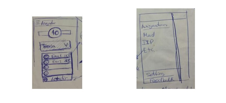
The first sketch I made, showing clearly the course grade, groups and exams within them, also the NavigationView with all courses.
In the first version, when you first entered, a tutorial appeared explaining how the application worked because when you entered without explanation, you might not know how to do almost anything, and this told me that the design wasn't good. I also used dialogs to fill in information. These things made me think about a better interface for a new version shortly after creating the application, a year ago.
Already thinking about v2.0.0 of #GradeCalculator more intuitive. For next year. pic.twitter.com/ga4kqglefO
— Antonio López Marín (@tonilopezmr) April 21, 2015The new interface should be similar but without making too sudden a change, the grade should be clearly visible in large format, you should be able to see everything at a glance, and the behavior should be very similar - basically, you enter the application and still know it's Grade Calculator but cooler.
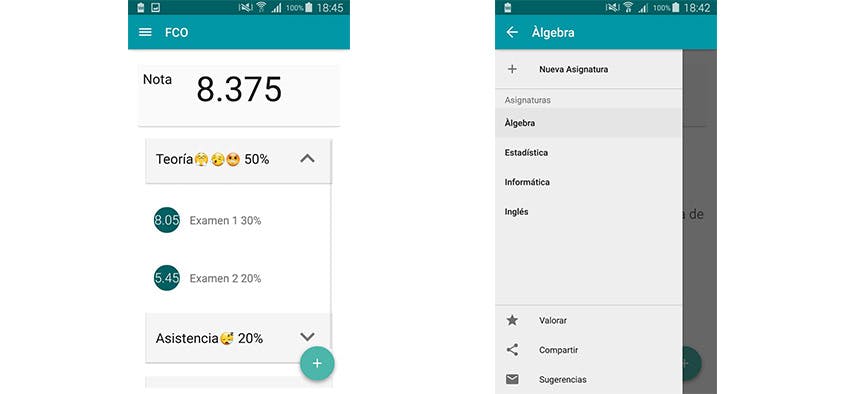
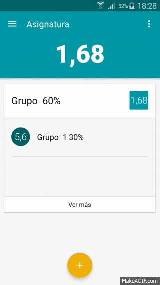
Now I would replace the horrible expandable sections with simple cards and always show the exams (even better visualization), also remove the dialogs for filling in data and add details for each entity, meaning that for each group or exam when you tap them you would see their complete details (going to another screen to show you the entire group or exam).
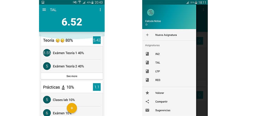
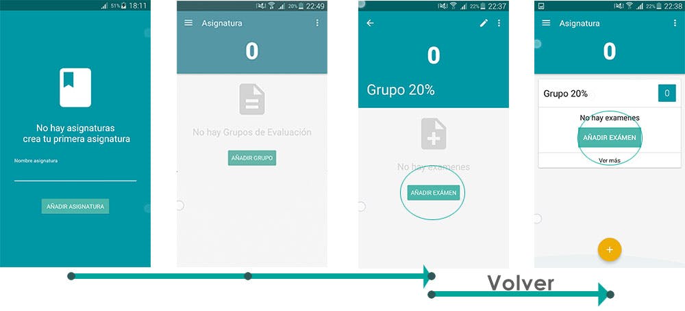
The course grade is clearly visible along with the groups and first 2 exams of each group. If you want to see more about a group, clicking on the group takes you to its details.
Detail for each entity
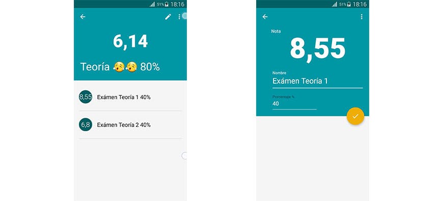
By having details for each entity, the options you can perform on each one are in that same detail. In other words, in the first version if you wanted to modify or delete an exam you had to long-press it and the options would appear, now the options don't have to appear when you press it but rather appear when you click on an exam and go to its detail showing you all the information and options you can perform on it.
Now having each entity's detail, editing and creation to fill in data will be done in that same detail showing you a full screen to fill in the data, verify it and save it.
Application Flow
As I've already mentioned, in the first version there was only one screen where you had everything, and to interact with elements you had to press and hold them for a few seconds.
Now there is a flow between the different three screens that exist; main screen, group detail screen and exam detail screen.
The flow is as follows:
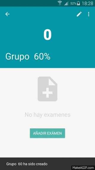
- You create a course, this course suggests you create a group.
- You create a group, this group suggests you create exams.
- You create an exam and it invites you to fill in its information.
- You return to the group, and it suggests you create another exam if you have more exams in that group.
- You return to the course, it suggests you create another group.
If from step 2 you don't go to step 3, but return to the course instead, it doesn't matter because from the course the group will appear and within this group it will suggest you create an exam - everything much more logical and simple without having to hold down elements or guess how things work.
Icon
The change in the logo has also been important, as I went from the first logo created with a friend, to making it completely material following the Icons guidelines. Initially it was going to remain square, but a friend suggested making it round. I wasn't convinced but when I created the round version and ran this survey:
It won by a landslide and I decided to use the round one.
Animations
The animations that make an application look so cool are somewhat visible in version 2, especially animated transitions. I could have added more but due to lack of time and motivation I only put animations when creating entities.
Add Group
Add Grade
Improvements
Even more things could have been improved, like when it shows the message that you've deleted a course you could do a rollback saying to discard the change and everything would be restored as it was. The NavigationView (the sliding side bar) could also have been replaced with tabs (Tabslayout) since many designers refer to the NavigationView's 3 vertical bars as the hamburger menu and the right menu with 3 vertical dots as the kebab menu:
Don't ever say you don't have choices on mobile. pic.twitter.com/Atu3Ogi58j
— Luke Wroblewski (@lukew) April 23, 2015A not too distant future
In an intermediate version I'm going to allow logging into the application so that courses can be saved in the cloud and not lost if you change phones, and also to be able to make a web version to learn how to make web applications.
For version 3 I will make it possible to share courses with the percentages of groups and courses, meaning being able to pass the structure that each course follows to your friends and not having to manually create groups that an entire class has the same or even an entire year.
You can download Grade Calculator and let me know what you think.